Colours and patterns in biophilic design that makes everyone happy
- Agi
- Apr 2, 2021
- 4 min read
Updated: Apr 8, 2021

A couple of weeks ago I had my first blog post about biophilic design and its importance in our everyday life. I also made suggestions that, due to our ever-growing built environment, we need to find ways of bringing in nature to our indoor spaces because this is just simply essential to have a happy, healthy, and balanced life. This time I would like to give you some practical advice how to actually incorporate elements of biophilia in your home and/or workplace. Yes, workplace would be just as important, but we may have less influence on that.
Instead of starting to look at the problem from the biophilia perspective (like most books about biophilia would do) I would like to look at it from interior design perspective. So, instead of – let’s say – telling you that the colours of nature are blue and green and earthy colours and therefore you have to bring these into your design, I would say, this: I obviously need a colour scheme, let’s choose from the ones that brings in nature. I believe this is a less abstract approach for those have less or very little experience in design processes. And then I will just apply this approach to other elements of the design, like patterns, lights, decoration, use of material, etc. Because colours and patters are the most visually obvious in a home décor, I will focus on these two today, but I will move onto other elements, as well, in later posts. (Sign up, so you won’t miss it!)
1. Colours
I wrote about the importance of your colour choices here, and this post will not contradict that one in any way. We are surrounded by colours and you just need to walk out to the woods in an autumn afternoon to experience just how much deep colours we are provided by nature. Or you can walk into a tropical forest. Or lay in the sand on an ocean shore. Or have a bike ride through a spring meadow. Colours of nature are everywhere. So, when YOU think about nature what colours come to mind?
The most obvious ones are:
Earthy colours – sand, stone, timber, terracotta
Blue hues – sky, sea, lakes, ocean
Green hues – foliage, forest, sea, lakes
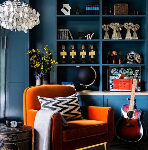
But how about oranges, pink, purple? Are they not colours of the nature? How about this image?

However, applying a colour of nature to our home when it comes to biophilic design is not that simple. We cannot just state that green is calming. Yes, there are green hues that are calming. There are others, though, that are not at all. The intensity of a colour plays a big part in how a particular colour make us feel. Bright, vivid colours just as pale, light, or even dark colours can all be found in nature, so we can always go back to the principal of colour psychology and first think about how we want to feel in a particular room. Then looking at the images of nature will give us a beautifully balanced proportion of different tones.
Something like this:
2. Shapes and Patterns
Studies found that even looking at images of nature have a calming effect on our brain activity. Now, this is really great news as even in the busiest cities, where there is no or very little direct connection to nature we can go home and enjoy the benefit of it if we design our home with biophilic principles in mind. An obvious choice could be to hang pictures/paintings of landscapes, woodlands, shores or animals. The bigger in size is the better. But what I suggest is that we try and really surround ourselves by natural elements.
Ugly and beautiful are subjective. People's perception of nice and not nice vary hugely! But, research shows that there are certain patterns and forms that most human find aesthetically pleasing. These are often the ones can be found in nature. Fractals, spirals, curves, circles, symmetry are EVERYWHERE in nature. Pattern can be found on wallpaper, bed linen, but it could be architectural, like repeated beams or arches.
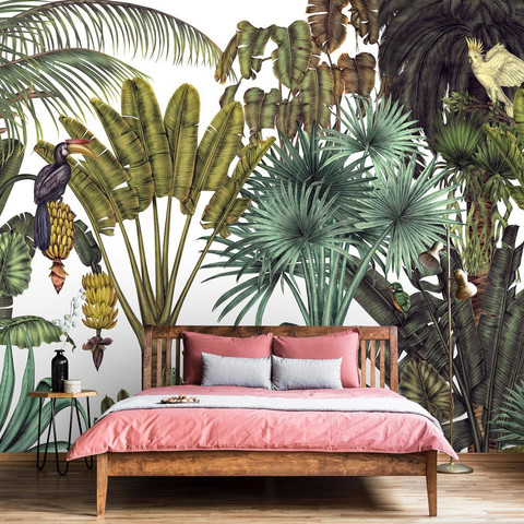
Bringing in patter in a most impactful way is wall papers or wall murals – so popular and so many to choose from – big leaves, tree trunks, even wildlife for a slightly quirky taste!
Check out this website for AWESOME wall murals (all images from below are from Photowall):
And finally
Just a little personal experience about the challenges of biophilic design in a home in a big city environment. I asked my partner the other day for a design brief of our living room. He LOVES plants. He spends a lot of time (and money) looking after and propagating them. He kinda’ picked up some designer language by now, having been by my side for a while, and although he struggles to comprehend a concept board (like most men in my experience – I think it’s a man thing), he can express the desired feeling of a room. So, he says: “I want to feel like I am in a forest”. For a brief second, I thought, ok that’s easy! But then he added: “…but I don’t want wallpaper with trees on the wall”. Errm… ok… So, this needs to be some sort of abstract approach, I guess. And I get it, why. I also like a challenge!
Well, you will have to keep following my blogs, as this brief is yet to be met, but certainly a very interesting one and, of course, a very important one, as well.
Until next time, x Agi


Comentarios